VISUAL IDENTITY PORTAL

Purposeful storytelling paired with bold visuals.

Logo Suite

Ai and EPS are vector files, and should be shared with professional designers and printers. JPGs and PNGs are for internal use (Word documents, PowerPoint presentations, etc.); CMYK for print materials and RGB for digital/on-screen applications.

Logo

GL13 logo

Logo Reverse

GL13 Logo Reverse

Logo Icon

Logo Icon

The logos should have a dice worth of clear space around them.

Colour Palette

The primary colours should be used equally throughout communications, with green appearing first. The colours should not be used as a tint or shade. Grey is recommended for any light backgrounds.

Web Content Accessibility Guidelines (WCAG) is a world-wide standard. Compliance to these standards ensures all users are able to access a website. There are three levels of compliance, A, AA and AAA. One of the largest considerations onscreen is contrast for text, the following demonstrates the level of contrast/compliance for each colour. Only colour combinations that reach a level AA or AAA compliance are shown here, as they are the most accessible applications.

Typography

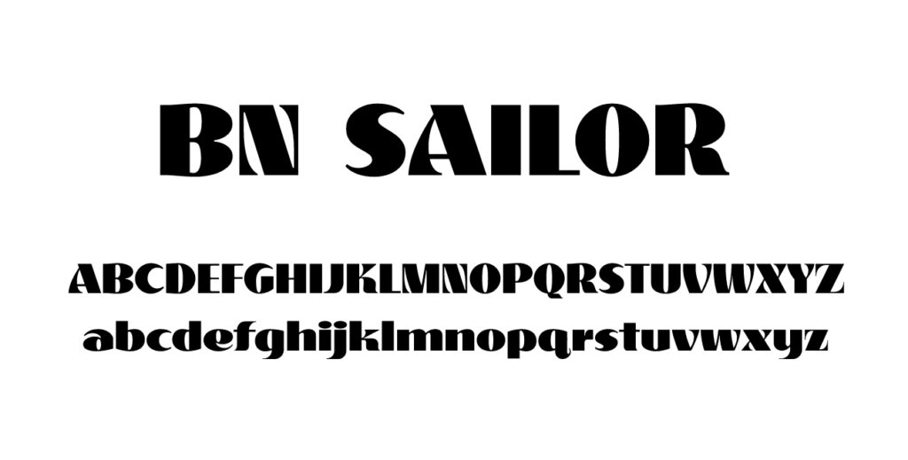
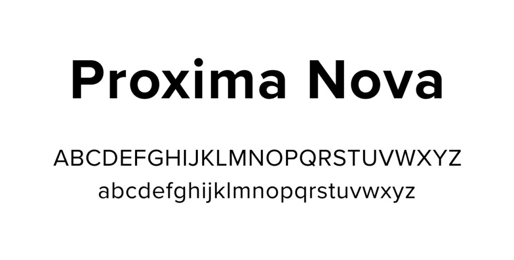
BN Sailor is only used for headings and bold brand statements. All other text should be set in Proxima Nova.

Graphic Elements

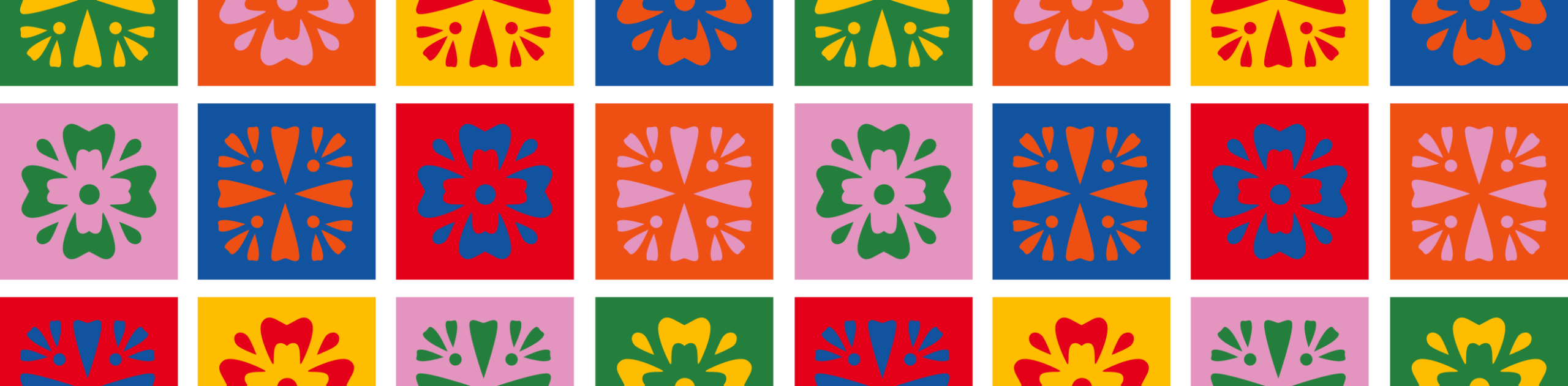
Geometric Pattern

Pattern

Icons

ladybug
horseshoe
star
rainbow
fish
leaf

Photography

Headshots

Stock

Below are a sample of stock photos currently being used by the brand. When sourcing new images look for photos that feel authentic, polished, and on-brand. Choose images with natural expressions, good lighting, diverse people, clean composition, and settings that fit your message. Avoid anything overly staged, generic, cluttered, or outdated.


Strategic Communications for Non-Profits Doing the Impossible.

©2026 Goodluck13